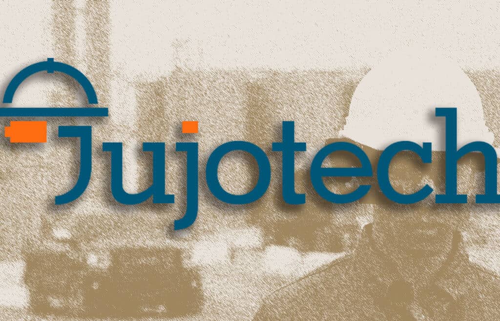
After the completion of our product line logo re-design last year, we felt it was now time to update our corporate logo. Our primary objective was to be in more visual sync with our vision, mission, and clientele expectation.
“We wanted to keep a certain amount of continuity and preserve the basic elements of our brand image”, says Massimo Romano, Jujotech creative Director, “while, at the same time, presenting a new concept that represents our intense focus on our clients.”
All of Jujotech products have two basic elements: a circle and a dot. The dot is always the same color “the same core software”, where the circle and the typography identify the different apps. The simple structure also makes it easier to display the products in different contexts/interfaces.
Starting from that consideration, for our corporate logo, we wanted to also emphasize our core clientele: the industrial workers-at-the-edge, highlighting one of the most recognizable tools they use: the smart glasses. From the old logo, we customized the typeface and made the capital J also part of the main symbol icon: the worker. That inextricable fusion between icon and typeface underlines our complete attention and focus that we promise to deliver to our clientele.
The symbol itself also adapts to all the applications where the full logo would not work properly. The main palette of the brand stays the same, with some fine tuning of the chromatic values: blue as a solid corporate color and orange as an illustration of the innovative force within the company.
Re-designing an existing brand can be a tricky business. We hope that you like the new look as much as we do. Jujotech firmly believes the new look will help us both maintain and enhance focus on you, our highly valued client.
